Is WWE’s branding harming the quality of the Product?
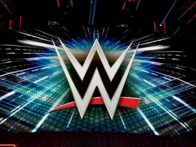
On the 02/05 edition of SmackDown, we have seen another reveal of a new or as in this case reworked championship. This is the second championship reveal we have seen this year in the WWE with the World Heavyweight Championship. Both championships share one very important detail: they have a giant WWE logo in the center of the championship and even more logos on the side plates and strap itself.
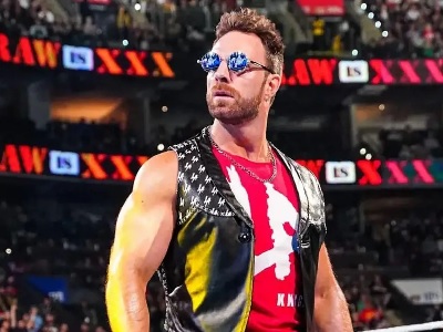
This trend of branding has been going on for a while now within the WWE. A great example is the LED barricades that were introduced at the beginning of the last year. These barricades only serve one purpose: showing off the show’s name. Another great example is the current stage setup, which only has a giant LED wall.
These measures ensure the constant visibility of the WWE logo and the show’s name but all these measures turned the WWE stages at events more into a billboard and a distraction for the viewer. As well as distracting the viewer these simpler stages also lack creativity as an example opposed to the old Titantron movies we always had now we have a simple name and sometimes a logo that is slightly animated. This helps to show off the wrestler and present them as a product of their own but this will rarely help a wrestler and more than likely make them seem generic than actually interesting.
With all these disadvantages this raises the question rather all this branding is even worth it. In my opinion, it would benefit WWE heavily if they grow their product organically by delivering a good product instead of forcing advertisements for a mediocre product down everybody’s throat.
